Mastering the Art of Subtle Color Gradation in Design
Mastering the Art of Subtle Color Gradation in Design
Understanding Subtle Color Gradation
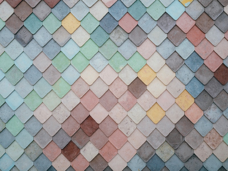
Subtle color gradation is a technique widely used in various forms of design and art, allowing creators to blend colors seamlessly from one shade to another. This technique can evoke emotions, guide the viewer’s attention, and enhance the overall aesthetic of a design. In this article, we will delve deep into the concept of subtle color gradation, its applications, techniques, and tips for perfecting this art.
The Importance of Color Gradation in Design
Color gradation plays a crucial role in how visual content is received. It can improve readability, create depth, and add a dynamic element to a design. Here are some key reasons why subtle color gradation is essential:
- Visual Appeal: Gradation creates a smooth transition between colors, making designs more visually appealing.
- Emotional Impact: Different color combinations can evoke different emotions, which can be crucial in marketing and branding.
- Focus Direction: Subtle transitions can guide the viewer’s eye from one part of a design to another, enhancing the narrative.
Applications of Subtle Color Gradation
From graphic design to interior decor, subtle color gradation finds its application in various fields. Let’s explore some prominent areas:
- Graphic Design: Used in logos, posters, and websites to create a sophisticated look.
- Photography: Photographers employ gradation to produce striking images that capture the viewer’s attention.
- Interior Design: Wall paints and furniture often utilize subtle gradation to bring warmth and elegance to a space.
- Fashion Design: Dresses and fabrics may feature color gradients to create designs that stand out.
Table: Benefits of Using Subtle Color Gradation
| Benefit | Description |
| Improved Aesthetics | Enhances the visual beauty of a design by providing a smooth flow of colors. |
| Emotional Connection | Creates feelings and moods that resonate with an audience. |
| Attention Guidance | Directs the viewer’s focus to essential elements within a design. |
| Versatility | Applicable in numerous fields, from graphic arts to physical spaces. |
Techniques for Creating Subtle Color Gradation
Mastering the technique of subtle color gradation requires practice and an understanding of color theory. Here are some effective methods to achieve beautiful color transitions:
1. Choose a Color Palette
Begin with selecting a harmonious color palette. Utilizing tools like Adobe Color or Canva can help you visualize color combinations. A well-thought-out palette will lead to more impactful gradation.
2. Use Gradients Tools
Software like Adobe Photoshop or Illustrator provides tools specifically designed for creating gradients. Use the gradient tool to blend your colors smoothly.
3. Experiment with Opacity
Adjusting the opacity of certain colors can add depth to your gradation. Layering semi-transparent colors can yield a subtle effect that isn’t overpowering.
4. Consider Lighting Effects
If you're working with 3D designs or photography, take lighting into account. Shadows and highlights can significantly enhance your color transitions.
5. Review and Adjust
After implementing your color gradation, it’s crucial to review the design as a whole. Sometimes, adjustments in contrast or placement can elevate the overall aesthetic.

Common Questions About Subtle Color Gradation
As you delve into the world of color gradation, you may encounter certain questions. Here are some of the most frequently asked questions:
What is the difference between color gradient and color gradation?
While both terms are often used interchangeably, there is a subtle difference. A color gradient is typically a smooth transition between colors, while color gradation might imply a more nuanced approach to transitioning shades.
How do I pick the right colors for gradation?
Choosing the right colors depends on the desired emotional impact and the design's purpose. Complementary colors often work well for creating engaging transitions.
Are there any rules for using color gradation in design?
Yes, while creativity knows no bounds, understanding color theory principles and balancing colors is key. Avoiding overly bright or contrasting colors in subtle designs is generally advisable.
Practical Tips for Effective Color Gradation
Here are practical tips to consider when experimenting with subtle color gradation:
- Start Small: If you’re new to color gradation, start with minor changes before moving on to larger designs.
- Seek Inspiration: Look at examples of successful designs that utilize color gradation for inspiration.
- Ask for Feedback: Don’t hesitate to ask peers or other designers for their opinions on your color choices.
Conclusion
Subtle color gradation is more than just a technique; it is a powerful tool that enhances designs and captures attention. From its emotional impacts to its versatile applications, mastering this art can significantly improve your work. Remember to choose your color palette wisely, utilize tools effectively, and always stay open to experimentation and feedback. By incorporating subtle color gradation into your designs, you not only increase their aesthetic appeal but also improve their effectiveness in communicating the intended message. As you hone this skill, keep in mind the importance of practice and patience, and enjoy the rewarding journey of creative design.
